After several previous versions for developers, the first public beta of Android 11 is here and comes loaded with news. This year we have not seen Android 11 in action at the Google I / O conference since it was canceled, but we have been able to test the new version and in this article We bring you our first impressions.
At the moment, the beta is available to download in the Pixel (from the Pixel 2) and other models such as the OnePlus 8. The rest will have to wait for the final version that should arrive in the fall. In our case, We have installed Android 11 beta on a Pixel 4 XL. We tell you about our experience.
More conversation-focused notifications
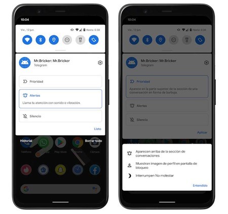
Notifications are one of the sections where we find the most news, starting with the conversations that in Android 11 appear grouped in their own section of the notifications drop-down and we can also sort them by priority. If we hold down on a notification of a conversation, a menu appears that lets us choose to mark it as a priority, so that it will always appear at the top if we have several alerts. In addition, the image of the person will be seen even on the lock screen and most importantly: they can interrupt Do Not Disturb mode.
If we mark a conversation as a priority, it appears at the top and can interrupt Do Not Disturb mode.
In this same menu, in addition to priority, we can also mute conversations or choose to show both sound and vibration alerts. This is something that we can do in the messaging applications directly, but without a doubt it is very practical to be able to control it in a unified way from the system itself without having to go app by app.
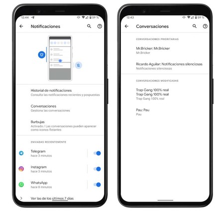
When we modify the conversation settings, they will appear in the Settings – Notifications – Conversations section. Above we have all those that we have marked as priorities and below the rest. It would have been nice to distinguish between conversations that we have silenced and those that continue to receive alerts, but Google unifies them in a single section which they call “Modified Conversations”.
In the notifications section there is also the new option to convert any conversation into a chat bubble, so that we can chat while using other apps (which could already be done with Messenger for a long time). However, although in the previous developer versions it did work for us, in the public beta we have not managed to do it.
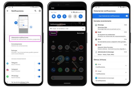
Another new feature related to notifications is that now the history is easily accessible from Notifications – Notification history or (even easier) from the button that has been added to the notification panel. This section shows us the notifications that we have closed recently and just below those of the last 24 hours grouped by applications. It comes in handy if we dismiss a notification and then can’t find it.
Unique permissions
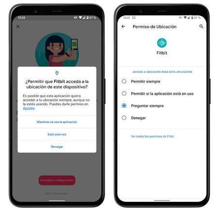
In the privacy section, Android 11 continues to improve the management of permissions and now we can grant permission for one time only in addition to the options always or while using the app. If the app in question again needs to access our location or any other section, ask us again. Also, when there are apps that we haven’t used for a long time, Android 11 automatically limits permissions.
A practical example is the WhatsApp SMS permission. It is something that we will only need once when configuring the app and there is no point in keeping it forever.
More information on connectivity in Settings
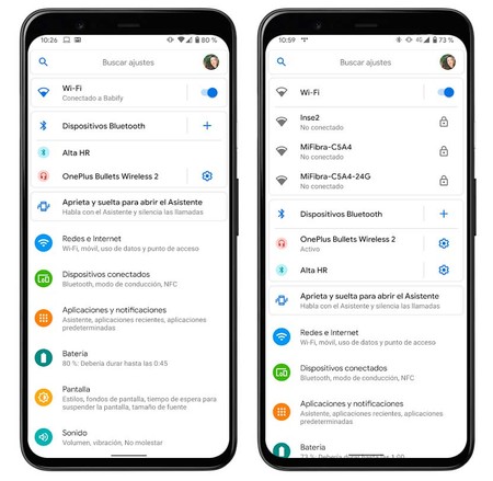
With Android 11, the Settings menu shows us a panel at the top dedicated to the available connections, both from WiFi networks and from known Bluetooth devices. Here we can see to which network we are connected (first capture) or, if we are not, those that are available. In the case of Bluetooth devices, it only shows us those that we have frequently connected with direct access to the settings of each one of them.
Taking into account that we can access this information by long-pressing on the WiFi or Bluetooth icons of quick settings, it is not a function that is essential, but it does not hurt that we can access these two sections quickly from more places .
Application tips in the dock
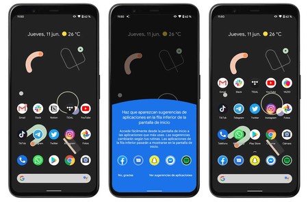
Application hints are a feature that was already implemented in previous versions, but now they can not only be shown inside the application drawer, but we can see them directly on the home screen, in the dock.
Application hints can now be seen on the home screen, but take up too much space.
I have personally disabled them almost immediately as they take away the dock’s place and make all the icons go up one row, filling the screen much more. In my case, I already have the apps that I use the most on the home screen and the suggestions are usually apps that I don’t need to have on hand.
New shutdown menu with control for home automation
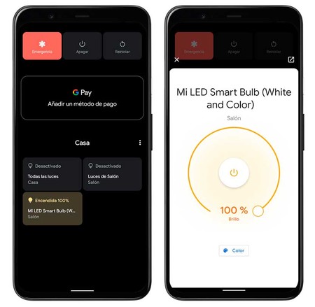
With Android 11, when we press the power button to turn off the mobile, a menu appears with many more options. At the top we have the usual ones (emergency, turn off and restart), but also the Google Pay information is added (which in this case appears empty because it is not possible to add a card in the beta) and the connected home devices that we have configured.
Pressing the different buttons once turns the devices on or off – in my case a light bulb – but if we hold down a menu opens with more options like adjusting the intensity or changing the color.
Other news: improved screenshots, new multimedia control and more
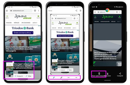
More news from Android 11 beta, this time related to the screenshots. When taking a capture, the thumbnail now appears on the side and allows us to select whether to share it or edit it quickly. Furthermore, it is possible take a screenshot from the multitasking interface, although here they have to polish the design because the text overlaps with the other buttons.
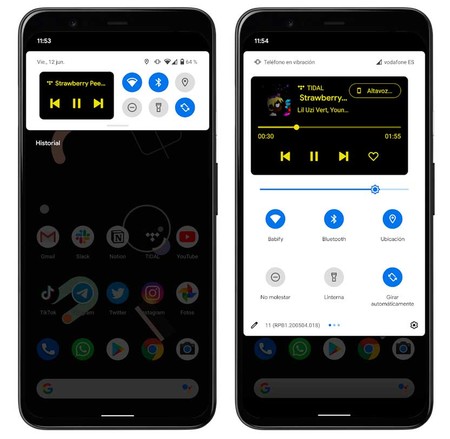
This function is activated from the developer options, but I found it interesting at the design level. It’s called ‘Media Resumption’ and what it does is nest the media control inside the quick settings panel instead of putting it underneath. It is much more compact and leaves the most recurring options accessible.
Android 11 beta includes other new features such as screen recording more accessible from quick settings or that we can program the dark mode the hours we want and not only associate it with sunrise / sunset
There is work to be done, but we are on the right track
Although I had installed the developer previews, in the last few weeks I have been using other different devices and have reached Android 11 beta without knowing in depth many of the new features included. All the conversation notifications section is one of the most interesting since it allows us manage and prioritize our chats from the system itself, avoiding us having to go to each application to configure whether we want to silence them or not.
I also really liked the shutdown menu with controls for home automation, for its design but above all its usefulness since it avoids having to access Google Home. However, it is a bit half done by that Google Pay that does not allow us to add any payment method as it is a beta version (although it is possible that this will be solved later). The suggestions of applications on the home screen is surely the least attractive function for me, although there will be someone who is practical.
The address is correct, but we would like to see a more comprehensive package of novelties when the final version arrives and, incidentally, solve various problems such as battery management.
In general, Android 11 is not a radical change from what we already knew from Android 10, but it brings some interesting functions and some much-needed ones such as unique permissions. The address is correct, but we would like to see a more extensive package of new features when the final version arrives and, along the way, several improvements such as fixing chat bubbles or better battery management as it runs down faster than usual. We will see how it evolves in the coming months.

