Google is testing a new design for Discover, its section in which it highlights the news that seems relevant. In this new redesign the classic card design is left out a bit so that everything is flatter, in line with the Material Design style.
This is a test at the moment, so we may see some changes when the final design arrives. However, it is clear that Google wants to give Discover a fresh air, so let’s take a look at the changes that come with this new design.
A somewhat cleaner design
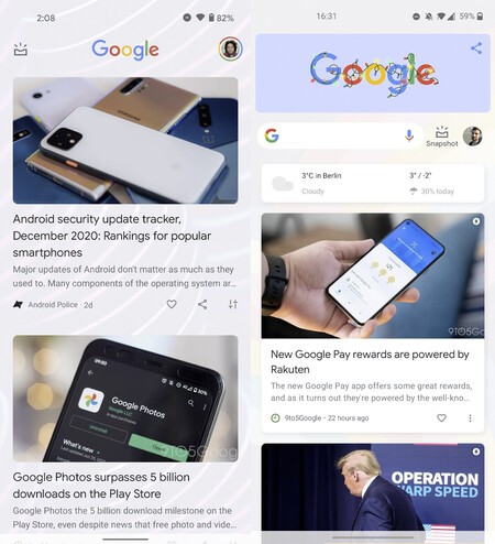 New design on the right.
 The UI-level refresh of Google Discover will come, as leaked, hand in hand with an even flatter look. The change would reach both the Discover interface of the launcher and that of the Google application, which present slight differences one with respect to the other.
Discover’s new design has been seen both in the launcher (left side) and in the Google app itself
First, We see that from the launcher, Discover will show a good part of the wallpaper, with larger transparencies and somewhat smaller cards. The search bar, located in the previous version at the top of the application, also disappears here.

 New design on the right.
 If we open the application from Google itself, we see the clean design again, although without a trace of the wallpaper. The cards in this case are quite similar to those of the previous version.
As is customary in Google apps, this new design is in the testing phase, so it could take a few weeks to reach all users. It is unknown in the same way if it will reach iOS. For now, it has been seen only on Android.
Via | Android Police