The interface of YouTube Music in order to Android Auto it had already become a bit outdated, and above all it was not very comfortable to use in the car. Now after more than two years without major improvements finally comes a new redesign.
Google has begun to activate in a staggered way a new YouTube Music interface in Android Auto, with a new design that completely changes the way you navigate within the application.
YouTube Music en Android Auto
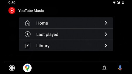 Old interface
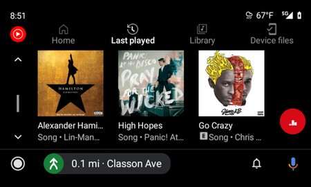
 Up to now YouTube Music As soon as the application was opened, it presented a navigation list to access the different sections of the application, such as its home screen, last reproductions or the library. Well, this changes by new tabs.
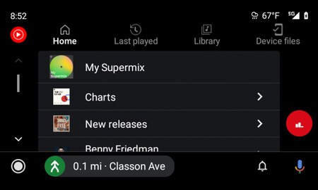 New interface
 With the new design, the user will always have each of the different sections of the application in view and accessible. You no longer have to go back to return to the navigation menu. Now in the upper part you will have direct access to the start, recent activity, library and files of the device. Therefore, we save a touch of the screen.
For the rest of the YouTube Music for Android Auto interface there are no more major changes. It still shows the albums and songs in rows of three. Since there is no need to go back to the main menu, the back button has been replaced by the YouTube Music icon.
 New interface
 The new interface is coming with the update to the version 4.30.50 through the Play Store. Updating the application on the mobile will activate this new interface that makes listening to music in the car faster and safer.
Via | Android Police