Google continues to promote the use of YouTube. Over the last few weeks we have seen changes, the most recent being the one that enabled a preview with sound in the windows. Now it’s the turn of improve playlists that we create on YouTube.
Android TV is receiving a change in the interface of the YouTube application, more specifically in the one related to playlists. A new design that makes them much more usable by adding an interface with clearer and more diaphanous controls.
More intuitive and usable
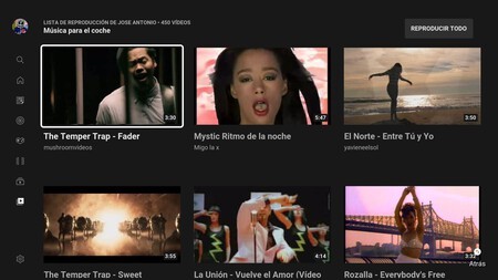
Current playlists interface
It is a change that comes with version 2.15.498 of YouTube for Android TV or Google TV. At the time of writing the news I have tested on two models, a TV with Android TV and a Chromecast with Google TV and I still have version 2.15.006, so the change has not yet been reflected.

In 9to5Google they echoed a change that is now beginning to reach more users. Playlists now have a new interface that shows the name of the playlist along with the buttons on the left. “Play all”, “Loop” and “Save to library”. The right area of the screen is reserved for the thumbnails of the videos.
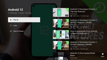
Until now, when entering a YouTube playlist, a window was opened in which the miniatures took up all the space while a button in the upper right area allowed “Play all” the content. This disappears with the new interface.
The new interface design in playlists is rolling out to Android TV and Google TV devices With the latest YouTube app update, version 2.15.498. Also, it appears that this is an update that needs to be enabled from the server, so there is nothing we can do to force it.
Source | 9to5Google
Images | 9to5Google
