Google search engine you will receive a major visual redesign that will completely improve the experience of the mobile search. Its manager, designer Aileen Cheng, reports that they have simplified the seeker to be faster and easier to find what we are looking for, giving a breath of fresh air to your entire appearance.
The new Google Search will arrive on our mobile devices in the coming days, but its redesign has not been easy for all organizing efforts and challenges they have found by how much Google Search has evolved.
This is the redesign of Google Search
After months of work, these are the five key points that drove its redesign to offer the best search results experience:
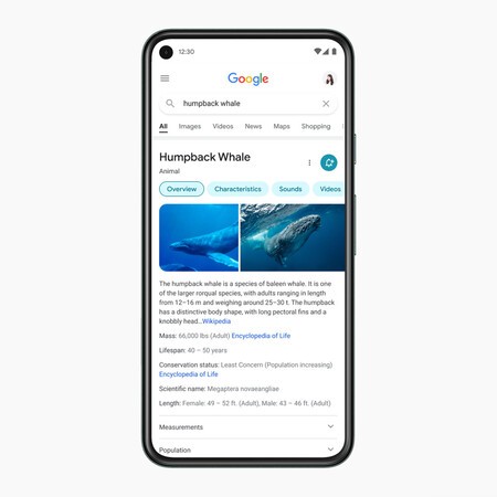
1. Put the information in focus: The design team simplifies the experience by taking a step back so the results take center stage. With the new look, people will focus on the information they are looking for and not on design elements.
2. Make the text easier to read: So that search results now shine the text will be bigger and bolder so the human eye can see and understand search results faster. Google’s own fonts that you already use in your Android applications are also used and are optimized for reading on mobile device screens.
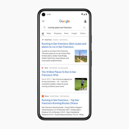
3. Create more room to breathe: They have decided to bet to show the results a edge to edge design and minimize the use of shadows. According to its designer, it makes it easy to immediately see what you are looking for. This way you have a little more space to display the information and let all the results breathe a little more.
4. Use color to highlight what is important: The new design aims to center content and images on a clean background and use color in a more intentional way to guide the eye to important information without overwhelming or distracting.

5. Lean on that “Googley” feeling: Finally, they take advantage of the “Google” logo style to bring that round design to other elements of the interface. Now your new icons and elements are more round, thus achieving according to Aileen a slightly more bubbly and lively design.

Via | Google