the interface Material Design has not stopped improving in all these years since it was released with Android 5.0 Lollipop in 2014. Since then the Android interface has been adapting to new trends, and we have seen how it has evolved with [Material Theming](Material Theming) o el actual Material You.
Google interface experts do not stop studying which are the best designs and animations so that applications feel more “elegant”, and for this they have recently carried out a survey to figure out what the right transition is.
The favorite transition by users
To discover which was the correct application transition among all the options offered Material Design, Google created an application that recreated the experience of ordering food, showing the dishes in a grid, and as users touched the menu, one of the seven transitions, or no transition. Google interviewed study participants to find out which transition they liked the most.
Most of the participants chose the transformation of the container as the favorite transition to open the information of each of the menu items. Participants offered a wide variety of reasons for this preference, from how the transition fit their expectations to the emotions the transition inspired.
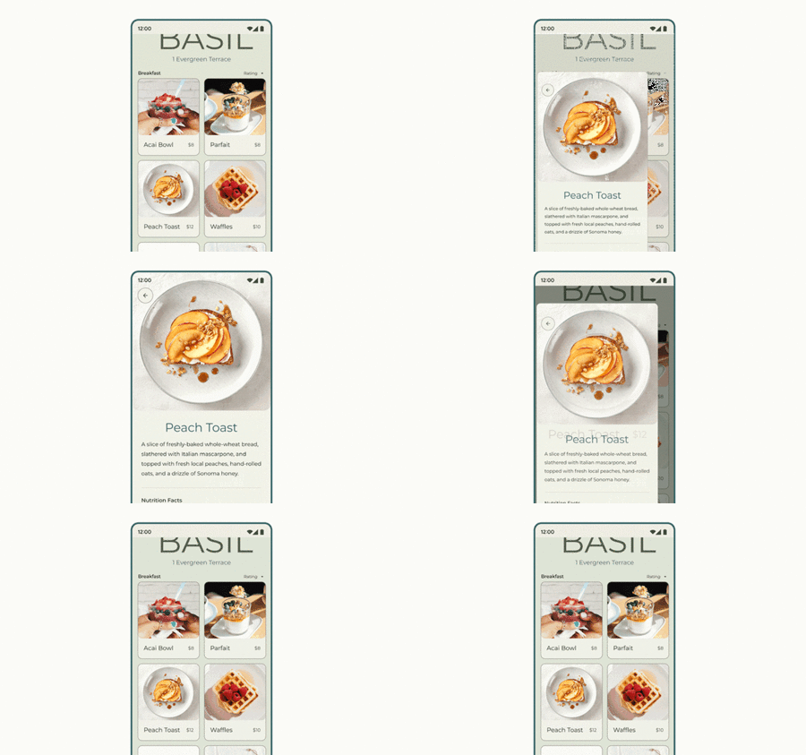
For many participants that transition fit the experience, as clicking on the card smoothly transforms to a new view in a very fluid and natural way. Some participants even said that this transition made the app feel warm and welcoming. Others reported that this transformation of containers evoked the feeling of picking something up to take a closer look or zoom in on a menu, as one would physically do.

With this study, Google has shown how the choice of a transition can improve the emotion and expressiveness of an application, as well as the importance of the animated transition between two pages. Google reports that no one transition fits all, but now we know that transition in which the container transforms into a new page It is the favorite of users. Perhaps from now on we will see more of this animation in Google applications and other developers.
Via | 9to5Google
In Engadget Android | Android 12: all mobiles that will be updated, complete and updated list
