If you make many online purchases through Chrome surely you know his autocomplete addresses and payment methods. The browser allows us to complete a form instantly, saving us time.
Currently, the Google Chrome autocomplete presents a drop-down list with the possible options that we have saved, but it has several drawbacks. This dropdown covers part of the form and does not allow us to fill only the selected field. All this and more inconveniences are improved with the new autocomplete bar.
This is the new Chrome autocomplete
Google is testing and activating a new version of Chrome (Beta, Dev and Canary) auto-complete suggestion bar which will appear just above the keyboard so as not to cover any component of the website form.
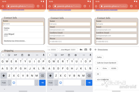 Left: old design, center and right: new design
 In the image above, the screenshots in the center and on the right we see the new design, with the new bar that shows us the suggestions when touching the field of a form. If we touch in one of its fields we will see the possible addresses that we have saved. If we touch on a suggestion it will auto-complete the entire form as in the old design.
Apart from the design change, the other important novelty is that now we have the option of clicking on the icons for passwords, payment methods or addresses to select a specific field, preventing the entire form from being filled in with the rest. of information.
If you want to try this new autocomplete design, all you have to do is install Chrome Beta or another developing version of the Google browser. You can use a test form to test it.

Chrome Beta
Track | 9to5Google

