Reforms in Google. The Mountain View team has been putting its services and applications in order for some time, and its latest changes have been far-reaching. How to put all your messaging app teams under a single command, how to launch a new API for augmented reality, how to implement the automatic deletion of our histories every 18 months or, as now, put in the car wash one of their most known and important: Google Photos.
Although the news that Google announces will still take a week to be applied to the different apps of the company, the truth is that the battery of changes is really significant since the service logo is also changed. After this, Google Photos will never be the same and it is something that we love because finally we will have a photo map thanks to the geolocation labels.
New life, new logo

As we said, Google Photos is under construction and one of the first changes occurs on his face. The folded sheet system that made the Photos logo look like a pinwheel is simplified. Now we will have half circles in the same position, all more streamlined. Of course, it will take us a while to get used to it although, a priori, the new logo seems more optimal when it comes to reducing it the maximum to make it, for example, an icon.
The long-awaited also comes to Photos world map of our photos with a clear similarity to Google Maps. In this map we will be able to see the photographs that we have taken provided that they have the geolocation tag active that indicates where they were taken. A new way to search our photos not by date or using the text search engine, but in a much more visual way.
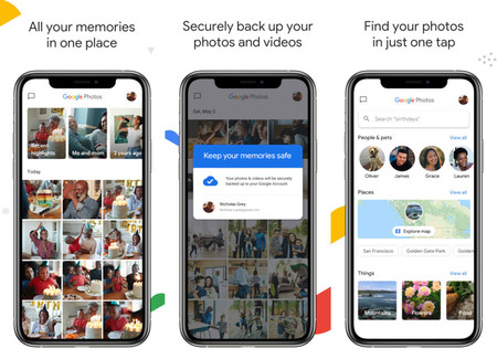
Memories of the application also undergo an aesthetic change. Google Photos abandons the circular icons so that the section takes on more prominence and resembles, to find a similar design, to that of the publications of stories on Facebook. The themes are also expanded and we no longer only have memories based on specific dates but also compilations from Google itself, such as our best photographs. An attempt to get us to print them?
Finally, the application interface is simplified in both the Android and iOS versions. The upper part is now for memories while the lower part is for photographs, search and our library. The map is hosted in the second tab while sections such as the trash or the photo archive are included in the last place.
More information | Google

